Responsive Web Design Principles
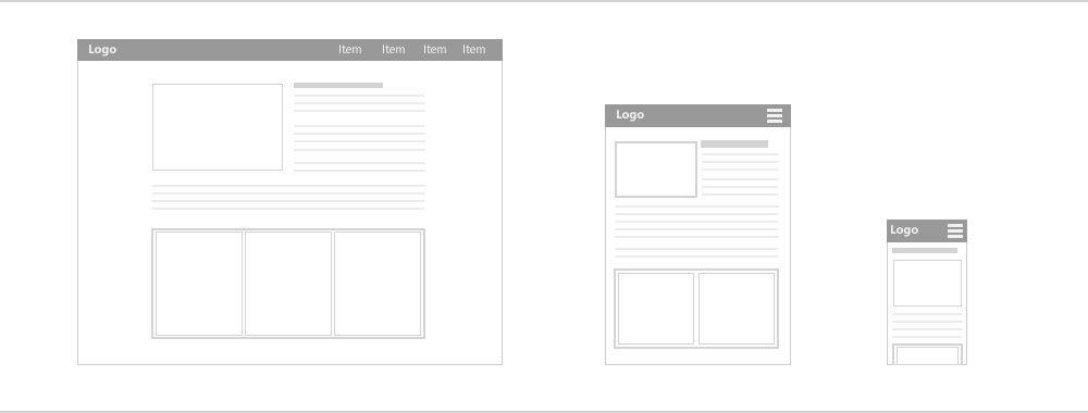
Most websites today are not making their name because the common web design they have is very inconvenient to use and needed to be adjusted to be able to use in different types of devices such as tablets and phones. It is very important to a certain website to be accessed easily without doing something to fit it in a certain device. Most people hate this kind of experience and the most common tendency is that that visitor will no choice but to not to visit that website again. If you don’t want to experience that disadvantage on your own website, you have to consider responsive web design.
Responsive web design is considered as the savior of all websites today to be able to have loyal customers and to attract more visitors. The main purpose of this kind of web design is to have an easy access and full convenience and flexibility in terms of surfing the website in many other devices that are commonly used nowadays. It is intended to make a certain website to attain excellent viewing experience. Using this kind of technique in your website will reduce panning, resizing and scrolling when it is viewed in several devices.
Principles
For further understanding on responsive web design, there are 3 principles that you have to know before you get into business:
- Fluid Grids
Websites are traditionally defined as pixels terms. This is the traditional perception about website, but unfortunately, this is a wrong perspective. Websites are not composed of fixed pixel such videos and images. Thus, many website that was generated from the previous years are not suitable for various devices such as tablets and phones. Most of them are only good for desktops or computer screens. Websites are composed of relative units that can be adjusted for certain devices.
- Fluid Images
Images consist of pixels that can shrink on a certain grid. An image has the ability to adjust on a certain size if the container has a smaller size than the size of the image itself. For example, the original image width is 800 pixels. If the preferred size of your image has a width of 600 pixels, once you put or attach that image on the container that has 600 pixels in width, the image will shrink to that new image size and the height will be automatically adjusted and remain the original image size ratio.
- Media Queries
A typical website has a landscape page layout and if you want to put it in a mobile phone, it is a little bit challenging for the reason that the layout of the mobile phones are in portrait. Hence, there are certain ways to be able to adjust your website in order to view it on mobile phones.
These are the 3 main principles that must be considered if you are doing innovation for your website such as responsive web design. It is very useful and convenient to use that a certain website still looks good even it was viewed on different devices.
Use responsive web design now and you are guaranteed to have an optimized design for your website.